stride drive & stride health mobile apps
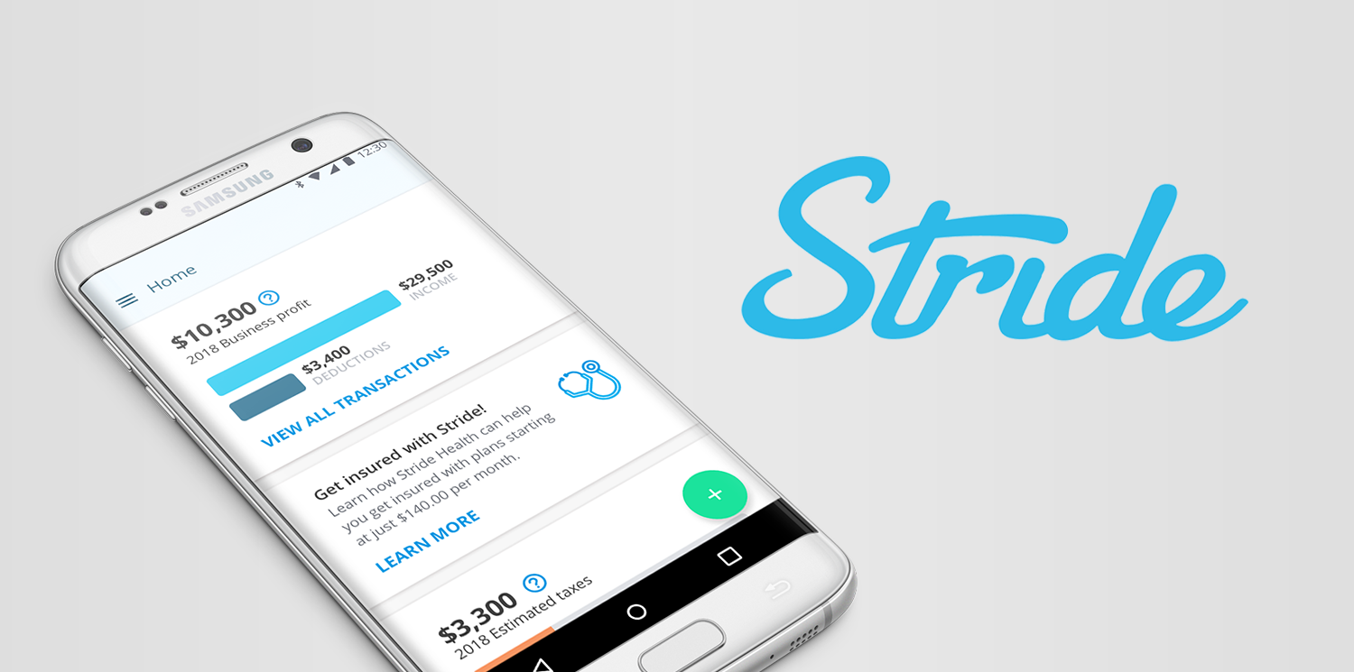
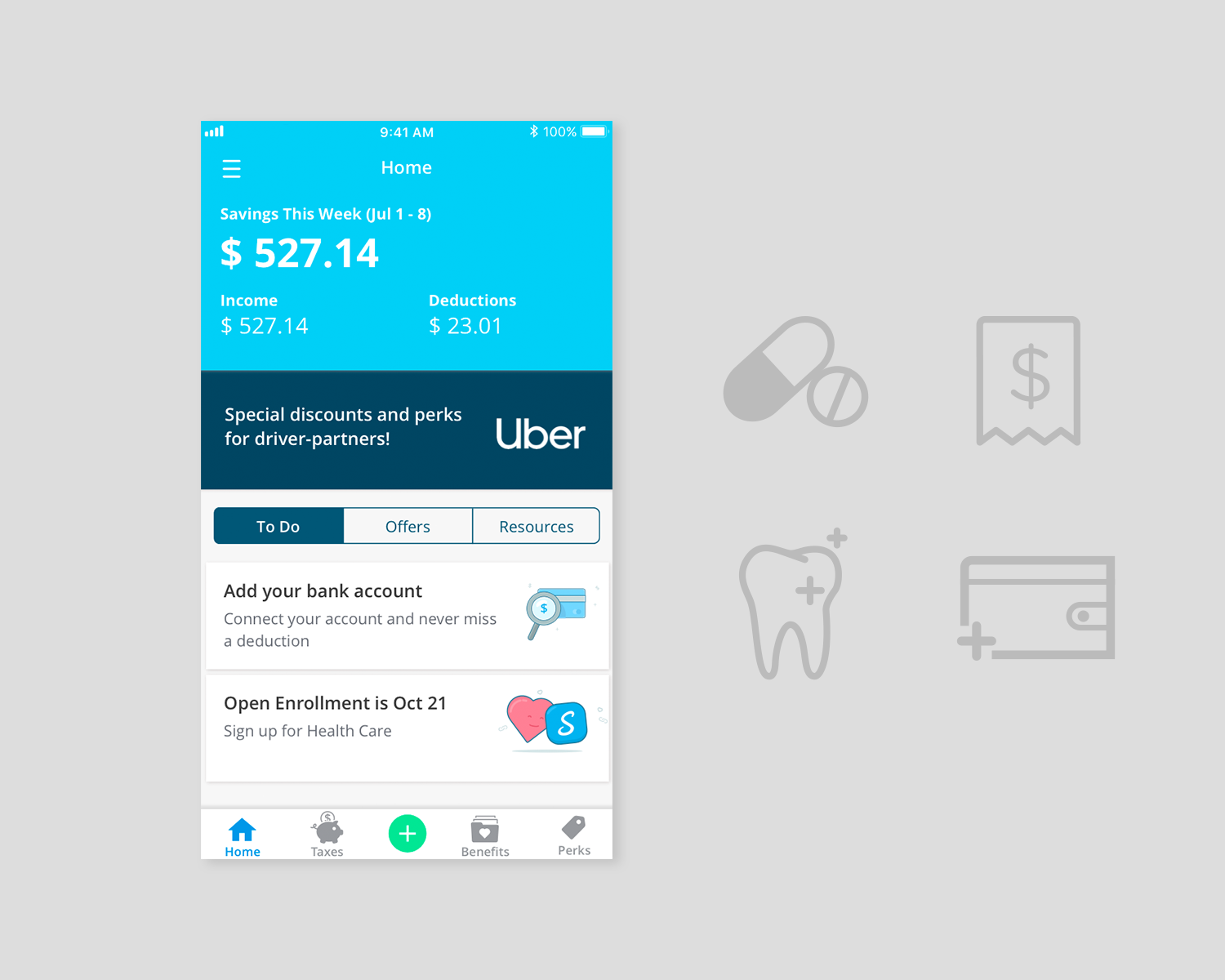
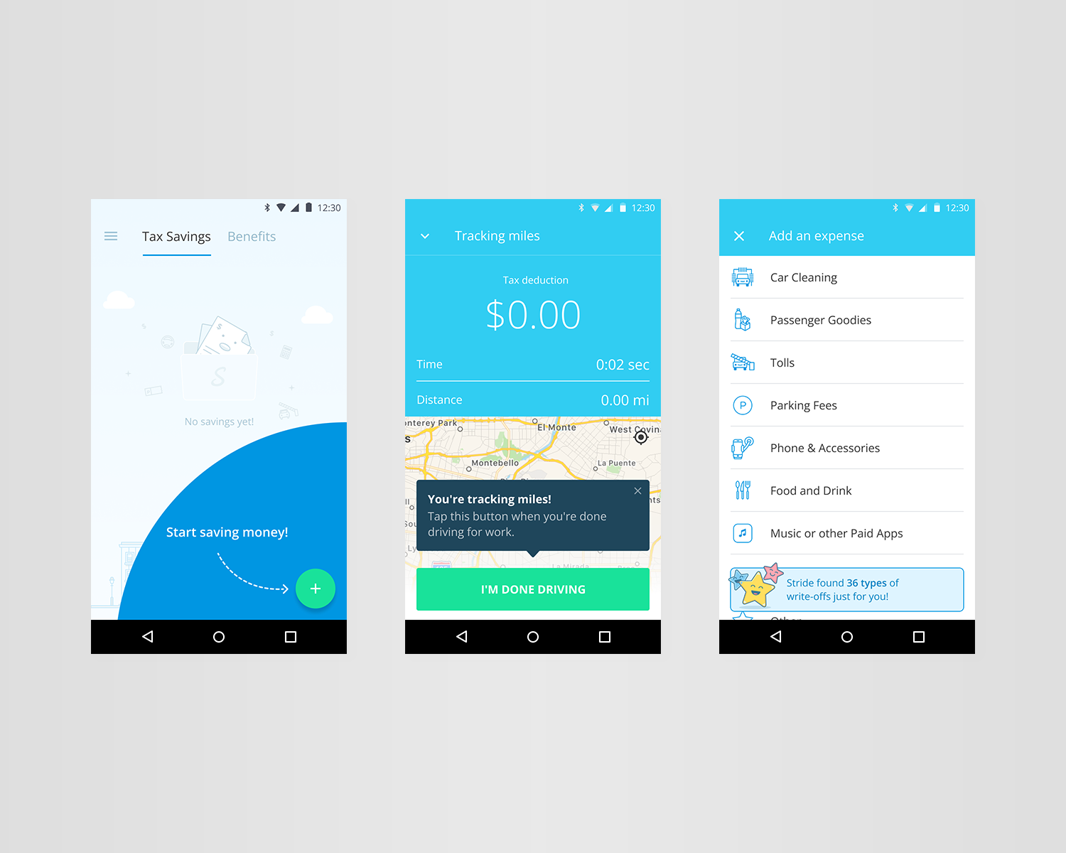
Stride Drive is an app with a cult-like status amongst self-employed gig workers. Along with one other lead designer, our collaborative efforts on a redesign of the app included features such as Perks for discounts on things like oil changes and gas for Driver partners. I ran user testing sessions with users discussing prototypes that I set up in InVision. I created a script and ran users, many of whom are ESL and work multiple self-employed gig-based jobs, through a flow where they could track their driving and expenses on the app.
The user testing results we received were informative and helped us decide which direction to go in with our ‘Perks’ ideation, while exposing gaps in some of the flows that needed to be addressed.
These sessions were some of the most informative in my UXR experience because of our efforts to reach users from a wide range of backgrounds. Rather than source our participants from the San Francisco Bay Area, I posted looking for users across the country. Many of them worked a combination of Uber, Lyft, Rover, and Postmates gigs, and needed an automatic driving and expense tracker that worked well in the background.
We learned that everything related to taxes was a benefit, but not top of mind for our users. Thinking that they would never qualify, health insurance was even less of a concern for many of the folks that we talked to. We knew that this was not the case and that significant improvements needed to be made in our communication design.
With improvements to the app including drastic changes around our verbiage, product localization and onboarding flows, we saw an increase in user conversion to Stride Health accounts.
In addition to working on Stride Drive, I was the lead designer on the partner app Stride Health, which serves as an alternative for self-employed folks who rely on the health insurance Marketplace through the U.S. Government. The roadmap for my contract laid out a suite of new features and a new health insurance purchase flow for the native apps and mobile web.
User testing sessions with Stride Health flows showed us that in addition to UI/UX improvements, we still had considerable work to do in terms of communication design. Many gig workers, purchasing health insurance plans for the first time ever, did not understand words like “premiums” “deductibles” and “copay”. Testing made it clear that users relied heavily on our existing 'plan comparison’ feature, so I redesigned it to make the information as clear as possible, removing what users skimmed over in sessions and A/B tested again, finding measurable success in the newer version.
Impressed by Stride’s mission and fantastic customer support, I myself became a Stride Health customer and purchased a health insurance plan.


