Scroll

hand written note stating allison was diagnosed with sudden acute hearing loss

First time attending Deque axe con · 2024

Being around my disabled peers, this conference made me want to be an inclusive designer.

This talk by David Thomas on advocating for accessibility at companies was particularly influential.

Case Study
image of texas music museum website scrolling inside laptop and static image of website on a mobile phone

Accessibility Internet Rally · 2024

Annual hackathon uniting strangers as teammates to create equal access to the web.

Thank you to Jared Cunha for teaching that modals can be accessible.

Attended Deque axe con · 2026

Most informative year yet—thematic talks on how AI falls short with accessibility standards and how quickly we need to adapt.

Image from talk by Sam Smith on Embedding Accessibility into AI

CASE STUDY

Type Annual Hackathon
Role Accessibility Designer
Year 2024
texas music museum site on desktop with accordion plugin opening and closing bios, shown next to it is plugin on a mobile device

Real world representation: our team was made up of members with a range of cognitive and hearing disabilities.


White and black vintage photography of country band

Educate audiences on rich history — with accessible outreach.

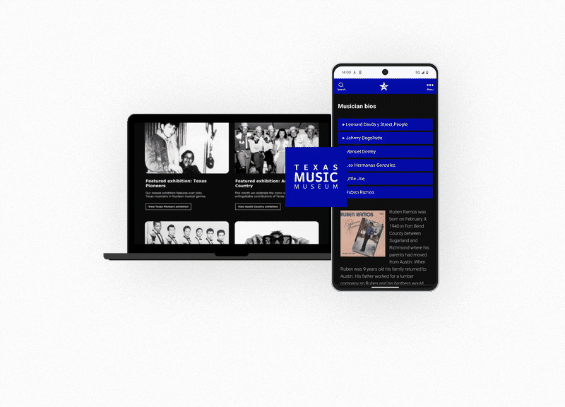
Our nonprofit partner, Texas Music Museum, has a passion for the musicians and artists that paved the way for modern music. We wanted to help them continue that passion in a way that was accessible to all.

TMM's existing site had a low contrast ratio, was difficult to scan for low-vision users, unnavigable by keyboard, and inaccessible on screen readers. The website was also not optimized for mobile devices.

Our team prepared to audit, redesign, prototype, test with disabled users, and hand off production-ready code to be judged by accessibility experts from Knowbility.

Asking the right questions before writing a line of code.

Before any design work began, the team aligned on four core research questions to keep users with disabilities at the center of every decision:

  • Can people with disabilities successfully navigate the site and find the Texas Music Museum's mission?
  • Can they find out how to visit the museum in person?
  • Can they find volunteer opportunities and ways to donate?
  • Can they access information about community resources?

Answering those questions meant accounting for a wide range of assistive needs from the start:

  • Users with limited vision may rely on screen readers such as NVDA or JAWS to browse and navigate.
  • Users with color blindness need to be able to differentiate colors without relying on hue alone.
  • Screen reader users require meaningful alt text and ARIA labels on all interactive elements.
  • Users with limited motor function may navigate with assistive devices such as mouth sticks, head wands, single-switch access, or adaptive keyboards.
  • Users who are hard of hearing need captions for any video content on the site.
screenshot of accessible accordion plugin from WPDeveloper site
screenshot of team meeting discussing accessibility of storymaps plugin

Accessibility-first and a happy client.

We started with a full WCAG 2.1 AA audit using Deque DevTools alongside manual keyboard and screen reader testing. We knew that our client had requested calendar integration, a Google Maps plugin, and other plugin features that all needed to be compliant. From there we began our research.

For CMS selection, the team filtered WordPress themes by the "Accessibility Ready" tag and selected a theme for its clean semantic structure and museum-focused layout — with a backup theme identified in case we hit any compatibility issues.

Color accessibility was built into the design process. I ran the client's requested palette through the Adobe Color Contrast Analyzer and adjusted values to meet WCAG standards before bringing them into Figma. From wireframe stage onward, I used the Stark plugin to flag contrast issues in real time.

texas music museum website scrolling inside laptop, next to it are two images of a color scheme with accessibility color contrast details

Our team mentor, who worked on the accessibility design team at Adobe, walked us through the same testing protocol used on their team: automated code scanning with the axe DevTools Chrome extension, keyboard-only navigation testing using tab and arrow keys, and a manual walkthrough using VoiceOver or NVDA to experience the page as a screen reader user.

I conducted user testing mid-sprint with a blind user while getting coaching from a blind mentor. The user testing participant helped our team identify issues with aria labels on buttons and forms and praised our research and implementation of a compliant event/calendar plugin.

From a non-passing site to six mobile-optimized full WCAG AA compliant pages in 150 project hours.

The redesigned site passed every WCAG 2.1 AA criterion and was structured in a way that the client could provide maintenance and future iterations. All interactive elements were keyboard and screen reader accessible, two-dimensional scrolling was correctly implemented where needed, and the site accommodates 400% zoom. Color contrast across all text and UI components met or exceeded the 4.5:1 minimum.

Key Takeaways